
Helping nurses & healthcare admins make more data-driven decisions while monitoring hospital patients
Project Overview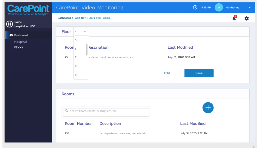
project overview
This project was personally important to me because it was an opportunity to help healthcare workers, who sacrifice their own mental and physical health for our well-being on a daily basis.
The tools they use to manage patient workflow are often complicated and frustrating. Caresight was a chance to remove some of the stress that healthcare workers encounter on the job by providing more intuitive and analytics-based tools that help them make smarter, more data-driven decisions.
Caresight also allowed me to grow through the coaching and mentoring of the junior designers on my team.
My Role:
UX Lead, Mentor
Deliverables:
User journey, Prototyping, Style Guide
Team:
Agency Owner, UX Intern, Visual Designer
Tools:
Figma, Sketch, Zeplin
the problem
Nurses and Healthcare administrators were having trouble understanding what was expected of them while setting up the system and understanging the overall hierarchy of information.
the solution
Collaborate with Product Managers to understand the high priority information nurses need to know to make quicker and more informed decisions while caring for multiple patients.
project atmosphere and challenges
I was called in to work with the agency owner on a top client’s project.
The agency and client were at a crossroads with this project. It went through a few different rounds of iteration, but the project still suffered from persistent issues.
My role was to come in and help the agency refine the project while also presenting the work and establishing strong and positive communication with their client.
I was joining the project late in the process on a tight deadline, and needed to learn as much as I could about users from existing research.
I worked closely with the agency owner, leveraging their library of prior research on their user groups.
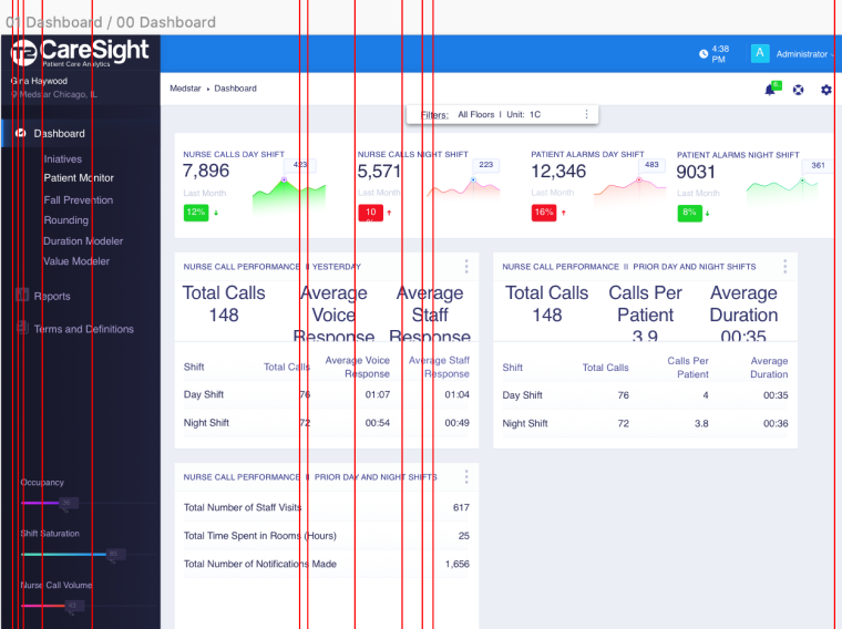
Screenshot of the agency’s last product with Caresight. We needed the new product to remain consistent with this one, while still delivering the best UX for the new product.
the client
Caresight is an advanced reporting and analytics-as-a-service solution focused on reducing risk and improving caregiver/patient experiences.
Caresight has decades of experience in nursing management and clinical workflows, and the agency and Caresight have been working together for over 10 years.
the users
Hospitals are extremely high-stress environments, and are becoming increasingly more data-driven. This particular project had three user types to design for.
Two of them, Nurses and Healthcare Administrators are split-attention users. Due to the nature of their job, they cannot dedicate all of their attention to the interface that they are using. Therefore, the majority of design decisions were made with them in mind.
The client requested one universal home screen that will work simultaneousely for the information each user would need (and are privy to) see.
NURSES
HIGH EMPATHY | HIGH STRESS | HANDS-ON
Nurses typically have a heightened sense of empathy and sensitivity to other’s needs.
On a day-to-day basis, they’re forced to make difficult and potentially life-altering decisions on-the-fly.
Recent reports (05/2019), show that nearly 30% of all nurses suffer from post-traumatic stress disorder (PTSD).
To help reduce their stress, our goal was to help them find the information they need fast, and provide some personal, conversational writing that would give them some sense of appreciation and caring from their superiors.
HEALTHCARE ADMINS
MANAGEMENT | LOCAL
Like Nurses, Healthcare Admins have reported that their sense of empathy is what started them in the field.
However, not working directly with patients, it’s easier for them to detach from a given situation and make the cool decisions that often need to be made.
Their duties include coordinating information between clinicians and facilities, patients, and other key personnel.
Admin work is detailed and difficult. It is not uncommon for admins to work long after their allotted shifts and hours, so it’s imperative that their tools are efficient and straightforward.

SYS ADMINS
CARESIGHT | BACKEND
Caresight offers a lot of customization to their customers.
Their Sys Admins need to be able to log in and read data from all user activity in order to address any issues that come up, as well as understand how to better the solution for their customer.
We wanted to solve this problem without resorting to error message and frustraing the user with re-directions. Here are some of the solutions we tried:
- A Wizard Nav explaining the parent-child relationships
- An Infographic demonstrating the navigation steps
- Adding quantity numbers to each parent in the left-rail
- Making items in the left-rail hoverable to show dropdowns allowing the user to choose all relationships at once
- A right-panel modal that appears when user clicks on a child relationship too soon, prompting them to choose the proper parent relationships first.
Ultimately, all of these paths were too long and not intuitive enough.
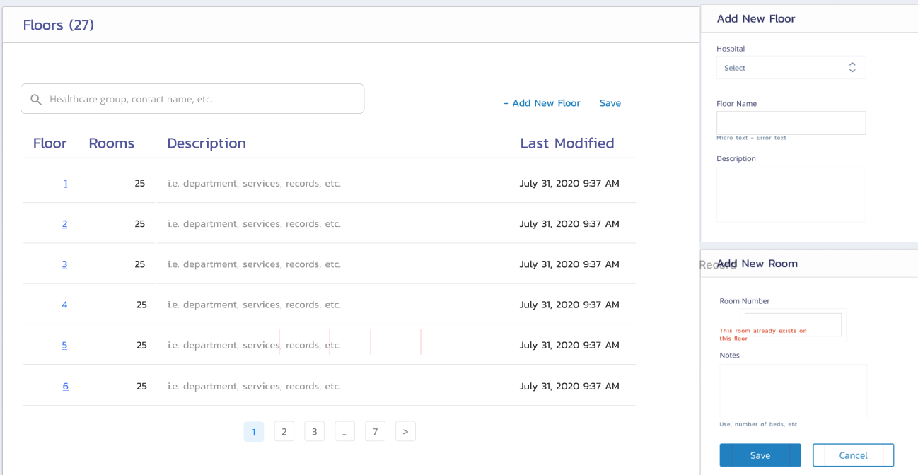
BEFORE - PROBLEM
Four screens for adding or editing a floor and/or a room to the system
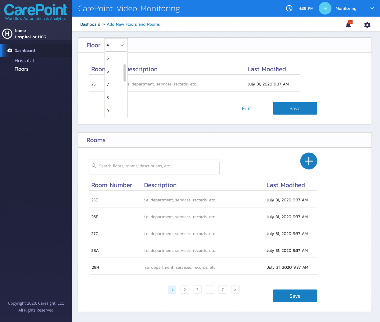
AFTER - SOLUTION
One, intuitive screen for editing and/or adding all floors and rooms
(ux) writing
We added helpful suggestions in each table and search fields so (our split-attention) users wouldn’t have to think about what information they might want to input for future reference.

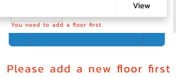
We also changed the tone of the microcopy throughout the product to be encouraging and helpful. Instead of “Error: Add floor first”, we used an easy-to-read, nuetral and polite “Please add a new floor first”.
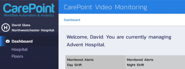
We wanted to provide some personalized text for healthcare users. The goal in welcoming each user by name was to further ease their stress by reiterating that they are in the right place at the right time, adding some more positivity to their workday
Design System
>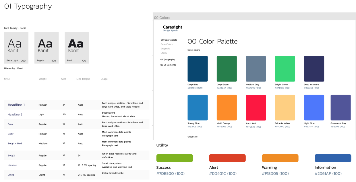
Revised UI components for Carepoint
The UI Design system we inherited had many things we didn’t need. A lot of the components were copied and pasted from external templates and libraries that weren’t relevant to the project.
CHANGES WE MADE
Working with and mentoring two junior designers, I helped get the design system in shape to ship to the client.
- We moved to a cleaner 8px grid
- We gave the tables more space, adding a relaxed row height of 64px high to accommodate text wraps
- Moved from grey background to white for tables
- Adjusted text sizes and weights to reflect the 8px grid and the new information architecture
- Tested colors for accessibility, changed from ….
- Doubled on UI communication - changed microtext to reflect error color as well
- Made sure iconography was consistent and in good quality to export. Not pixelated like what e inherited,
what i learned
This project was under a tight deadline which forced me to prioritize the bigger picture. Once that was addressed, we could come back and address the details that could be adjusted later.
I learned a lot about timing and how ongoing deliberation can affect the overall build of a product on a short notice.
I also learned a lot about project planning. Being brought into the project relatively late can be a disadvantage, but that doesn’t mean that the outcome will be less than stellar when we focus on prioritizing user needs and use our resources and dedication towards that goal.
leadership
While I’ve directed remote teams before, this was the first time I was asked to mentor other designers while guiding them through the project.
This included creating user personas and flows the team and demonstrate how to make user-centered design decisions.
Guiding the team to work together and providing them with the confidence they needed was an exercise in balance.
I wanted to trust these designers, but they were hourly employees not on my own payroll. A big portion of my job was to provide the guidance they needed, while also protecting the agency owner and making sure the project was up-to-par for the client.
As with every project, I am truly grateful to have been given the opportunity to learn and grow as a person and as a designer. I look forward to future collaboration with the team, should I be needed again.
< return home