project overview
I’ve been very interested in 5G technology for a while. When the opportunity came along to participte in a 5G project, I was really excited to be a part.
Part of this challenge was that the client had their heart set on lots of animations for their site. It was my job to make sure these animations complimented the user experience, instead of obscuring it.
Another challenge was to make Cellwize look attractive to potential investors, because their plan is to try and sell the company within a few years.
This provided me the opportunity to write strategic content and microcopy for Cellwize, while also building the wireframes for their site.
When I’m organizing things, I’m “In my element”. Cellwize was another great exercise in making the complex simple.
My Role:
UX Designer, UX Writer. (Client Lead)
Deliverables:
Site Map, Wireframes, Content Writing
Team:
Product Manager, Senior UX Designer
Tools:
Figma, (Keynote, Axure)
project atmosphere
The agency I was hired by onboarded Cellwize right before they had to fly to europe for a presenation. They had put together a quick site based for the client on the branding they did for them and their initial discussion.
They hired me at the stage of going back and planning the site.
My tasks included:
- meeting with CellWize to understand their business, product, and goals.
- maintaining communication with the client, submitting deliverables within our agreed timeline
- wireframe the structure of the site
- edit and write content and microcopy
I realized that the client had a lot of pre-conceived ideas of what they wanted, which included heavy animations.
This was also important to the branding agency I was working with, because it’s consistent with the other work they’ve done.
Some of Cellwize’s clients include Verizon, Nextel, Bell, and more.
users - what are their pain points?
There were three users to take into consideration:
COMPANY STAKEHOLDERS
Above all, companies upgrading to 5G technology need speed. High competition in this space demands that they adapt fast. A common frustration of theirs is that they need to offer 5G to their customers, but their revenue from it is staggeringly low. (This is also due to the competition in this space).

DEVELOPERS
Cellwize’s customization helps with adaptation, and choosing only what they need has the potential to ease and shorten the process for developers and cut their users cost.
INVESTORS
Investors visiting Cellwize’s site will be looking for key company information, like what events they’re attending, and to learn more about their team and background. It’ll be very important to know who Cellwize’s customers are, and how much of an emphasis Cellwize puts on their customers and user experience. While building the site, we put an emphasis on company transparency, tone, and level of professionalism.
information architecture
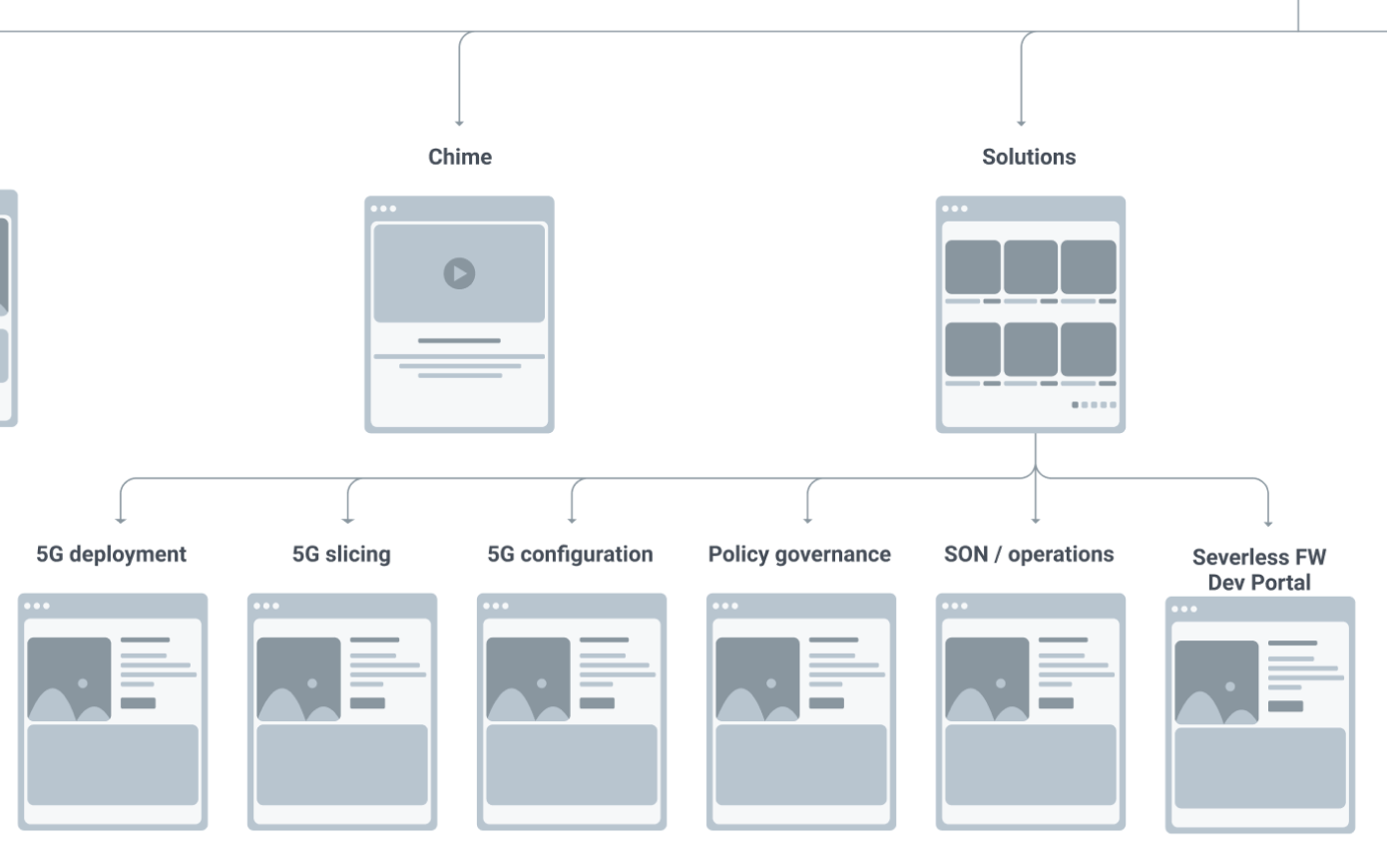
Screenshot of part of the Cellwize Site Map. Part of my work for Cellwize was to divide and name the services they offer.
Since the users are diverse, there was a challenge in helping Cellwize decide what their main CTA will be. Ultimately, we decided on “Request a Demo”. The plan was twofold. We wanted to direct customers to the sales team, while showing investors that
Cellwize also wasn’t sure how to best communicate their product descriptions from the homepage, and push users in the right direction. Since their parent product, Chime, is customizable, it became a platform from which their users can add separate “solutions” to.
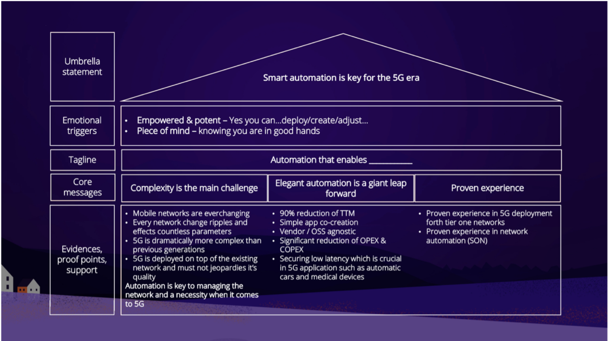
This is the brand key that the agency I was hired by put together. It represents the hierarchy of some of the information they wanted me to reference for the wireframing.
wireframes
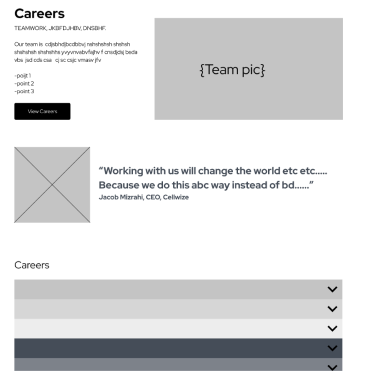
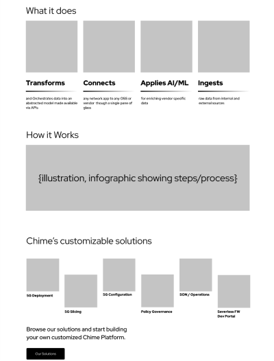
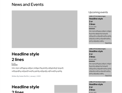
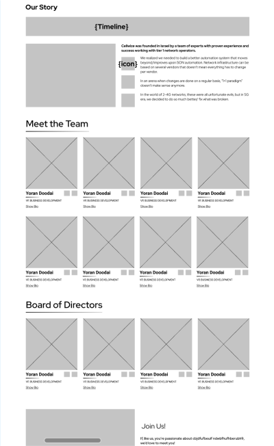
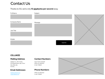
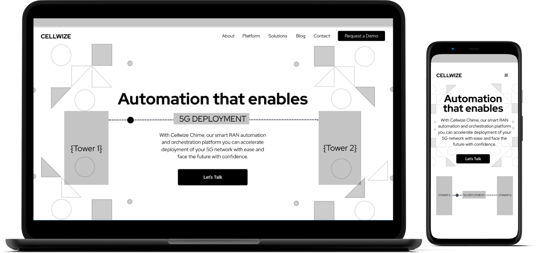
One of the primary goals was to present Cellwize as an upscale organization in the 5G cellular ecosystem. The previous site was cluttered, so I focused on simplifying the information architecture.
Our research highlighted the need to emphasize content discoverability for both our users and stakeholders. With this in mind, I constructed the wireframes with specific user personas in mind.
Finally, to help boost our site SEO, we created a way to easily add blog post links to the footer of each page.

animations
Every client has something they are really excited about. For Cellwize, it was the Animations.
While I really wanted them to be happy with the end result, I didn’t want to overload the project at the cost of the overall experience.
So, I focused on options that promote interactivity and delight while striving to guide the client away from animation concepts that would undermine UX methodologies and best practices.
Hero
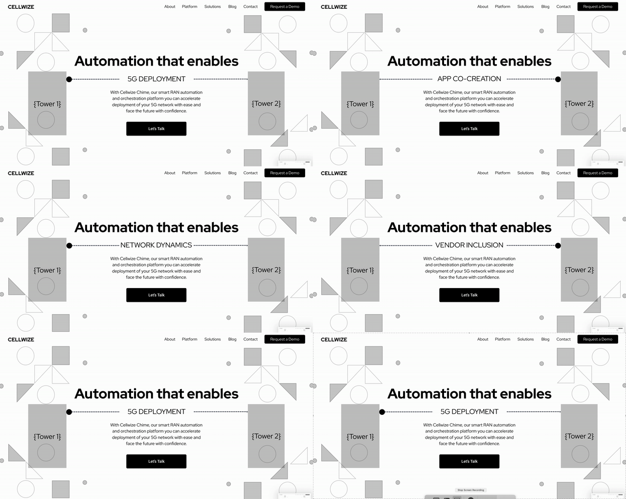
Our Solutions
To demonstrate the flexibility of the platform, I created an animation that connected users to alternative solutions. This translated into a molecule-like graphic that would move and alternate.
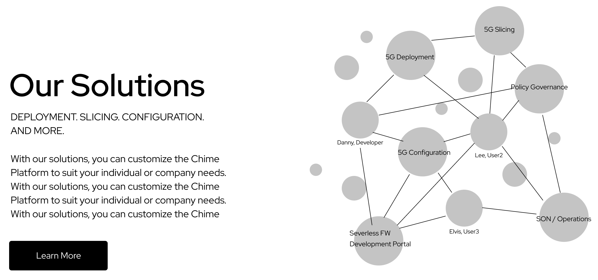
Demonstrating the Customizable Platform
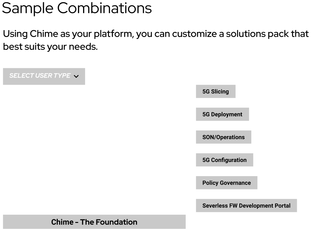
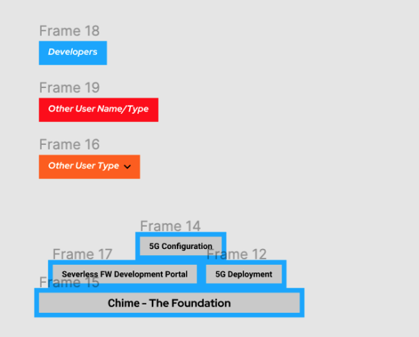
To further demonstrate the flexibility with the platform, I created a Tetris-like animation with building blocks. Users have full control of the animation. When a user type is selected, building blocks fly in and stack into a customizable solution.
(ux) writing
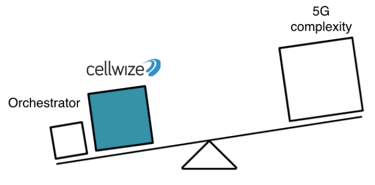
Cellwize’s edge was that they take away the complexity of adapting 5G. We wanted to leverage the content of the website to position them as experts in the market.
Easy Automation
Empowerment
Piece of Mind
easy automation
Above all, we value simplicity. The networking world is moving faster than ever,and we want to help you orchestrate your transition to 5G as quickly and cost-effective as possible.
empowerment
With Cellwize’s RAN Automation, the inconceivable is now possible. You can bcjsdbhsjd xbsabb. Your life is about t0 get a lot easier, and your business running better.
piece of mind
Our game-changing platform is only trumped by our high level of service and commitment to our client’s success. We’re here for you.
It was important to the client to impress investors and attract big-name clients. So, I opted for a knowledgeable but simple, authoritative tone for the microcopy. For buttons, I didn’t stray from anything other than the expected, but I used headers above them to attract interest and .....
Cellwize was founded in Israel by a team of experts with proven experience and success working with tier 1 network operators.
We realized we needed to build a better automation system that moves beyond/improves on SON automation. Your network infrastructure can be based on several vendors. And that doesn’t anymore mean that everything has to change per vendor.
In an arena when changes are done on a regular basis, “1+1 paradigm” doesn’t make sense anymore.
In the world of 2-4G networks, these were all unfortunat evils. In the 5G era, we at Cellwize decided to do so much better and fix what was broken.
I also opted for a sense of open-ness and transparency to help build trust, and threw in some refreshing, “nerd-like” copy that would appeal to developers.
Contact Us
Thanks to 5G, we're only 10 gigabytes per second away.
what i learned

This project taught me a lot about the world of young Startups and their visions and dreams.
Part of what I was hired by this agency for was to help guide the client to make good UX design decisions. Another challenge was to help them build a site that would work for them now and in the future.

In the middle of our time with Cellwize, the Covid-19 virus had just hit Europe. Italy and Spain cancelled two events Cellwize was counting on to meet investors. Understandably, this affected the way they felt about their budget for this project.
Sometimes the "evangelizing" of user-centered design has to be more subtle, and more private. Working with Cellwize was an exercise in wanting them to love their end result without compromising their end-users' experience.
