project overview
Roles:
UX/UI Research & Design, Branding, Copy
Time:
8 weeks
Tools:
Sketch, Invision Studio & App, Figma
Deliverables:
Competitive Analysis, User Surveys, Personas, User Stories & Flows, Content Strategy, Copy, Wireframes, Prototyping, Preference Testing, Branding, UI
The problems
Business owners have a hard time maintaining clear communication with their suppliers.
Lack of organization and forgotten commitments are detrimental to a healthy business relationship.
Damages and shipping mistakes are costly inhibitions that add up fast. They also mess up a retailer's merchandise planning.
Business owners are always busy running the above basic logistics of their business. They aren't left with enough time to spend with customers or to think of how they can grow.

The product
OCTA was designed to meet the unique needs of these business owners.
OCTA was originally conceived as a cloud application. User Research showed, however, that there are many more significant problems to solve. OCTA evolved into an app that helps people run the hardest parts of their business better.
the design process
The competition

Google Drive, Camcard, and Neat are all cloud applications that business owners use. They use each of them to organize different aspects of their business. Google Drive is an “all-in-one” application that is free and makes collaboration easy. Camcard stores business contacts and posts their companies news. Neat helps organize documents for accounting and tax time.
View SWOT AnalysisUser surveys
DEMOGRAPHICS:
- 40% of participants were between the age of 35-44.
- 33.3% were between the ages of 45-54.
- 26.7% were between the ages of 55-64.
- 97% of users were from the United States
WHAT I LEARNED:
- What tools our users are currently using. (Pinterest, Instagram, iCloud, Dropbox, Google Drive).
- What they felt was missing from these tools. (Lack of customization, overwhelming, hard to learn, not secure).
- What they liked best about these tools. (Easy collaboration, cost-free).
- How they discovered these tools. (Word of mouth, a recommendation from a colleague).
- 80% of users prefer to separate their business and personal communication.
Observation
Interviews
User personas
These personas are the combined result of the data from user surveys, interviews, and user observation.

Jen
Retail | Age 44 | NJ
Jen is a retailer and serial entrepenuer. She is excessively organized and cares a lot about making her customers happy.

Kew
Wholesale | Age 52 | NY
Kew is a veteran wholesaler. He sells to independent retailers like Jen and small department stores.
User stories
Items of high importance
As a retailer
- I want to be able to report damages directly to my seller
- I want to report shipping mistakes by referring to the invoice
- I want to generate invoices directly on site with images
- I want to record all business conversations for accountability
- I want to message multiple sellers at once to source an item
- I want to collaborate w/my supplier and share items to source
- I want to check sales history per SKU while ordering
As a wholesaler
- I want to learn how to source better products for my retailers
- I want to organize my business so I can focus on growing it
- I want to find more customers to sell my offerings to
User flows
ONBOARDING
I canceled OCTA’s onboarding flow after showing it to a senior design mentor. The onboarding proved to be intuitive during prototyping. My mentor taught me that the most intuitive onboarding is no onboarding at all.
SAVING AN ITEM
Research showed me what tools potential users are currently using for their business. I designed the original “Saving an Item” flow to pull data from Quickbooks, Google Drive, Excel, or Dropbox.
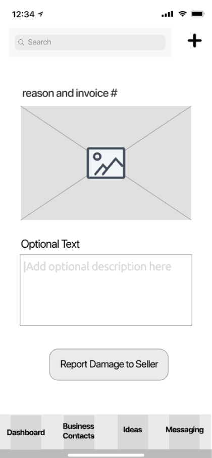
REPORTING A DAMAGE / SHIPPING MISTAKE
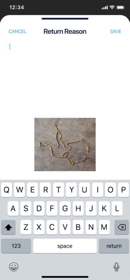
Users can report shipping mistakes by searching for invoice number or supplier. To help improve the quality of business communication, I did not offer an open text field. I learned from our users what reasons might be to need to return an item. I offered those reasons and added an "other" in case they don't see their reason on the list.
GENERATING AN INVOICE ON SITE
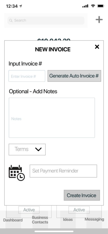
Some companies reported having a set number or letter system for their invoices. Some didn’t at all, and the process of creating one was distracting. I designed the option for a user to add a custom invoice number or generate a new one while creating an invoice.
MESSAGING / COMMUNICATION
View User FlowsContent Strategy
Read Content OutlineWireframes
OCTA was first designed for iOS. I referenced the Human Interface Guidelines to maximize accessibility. The screens to be accessible for both left and right-handed users. I tested the designs for color-blind users.
I included the developer in the wireframe testing. His insight and ideas proved invaluable before moving on to HiFi.
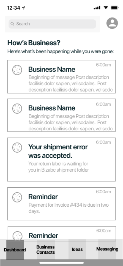
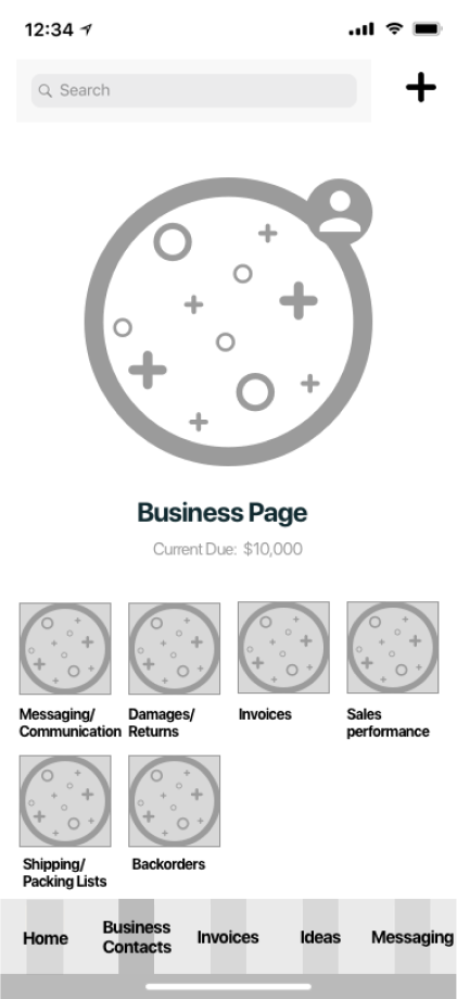
DASHBOARD / TAB BAR
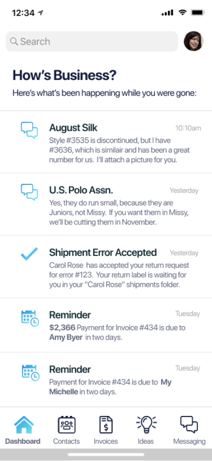
- Notifications of return requests, payment reminders for invoices, new messages and replies
- After testing - Invoice link directly from tab bar
- Access business-specific information directly on business contact page
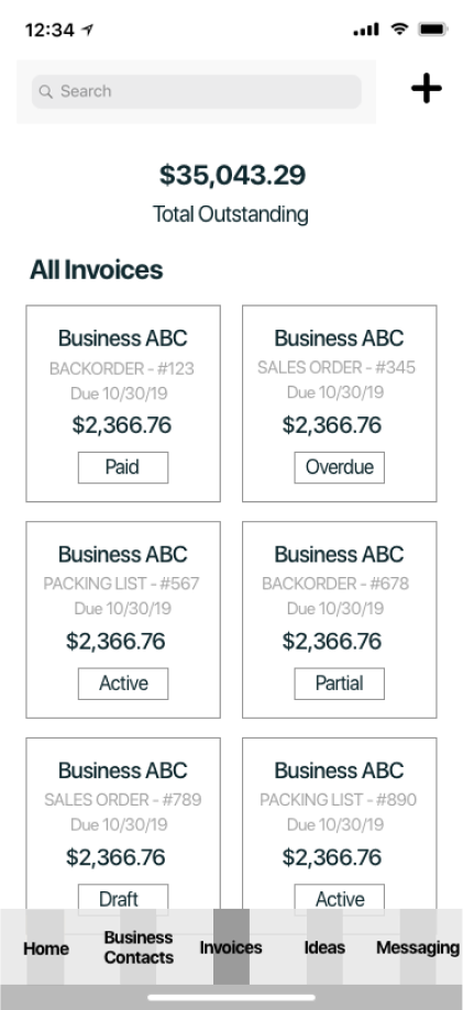
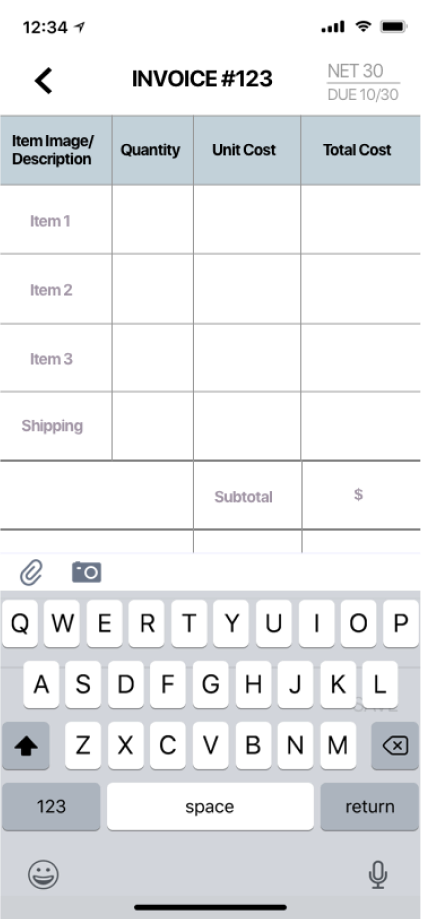
INVOICING
- Testing showed the need to clarify where an invoice is in it’s lifecycle. (Purchase order, Backorder, Packing list)
- Show outstanding amount in total and per invoice
- After testing - added shipping cell to clarify who pays & amount
Branding
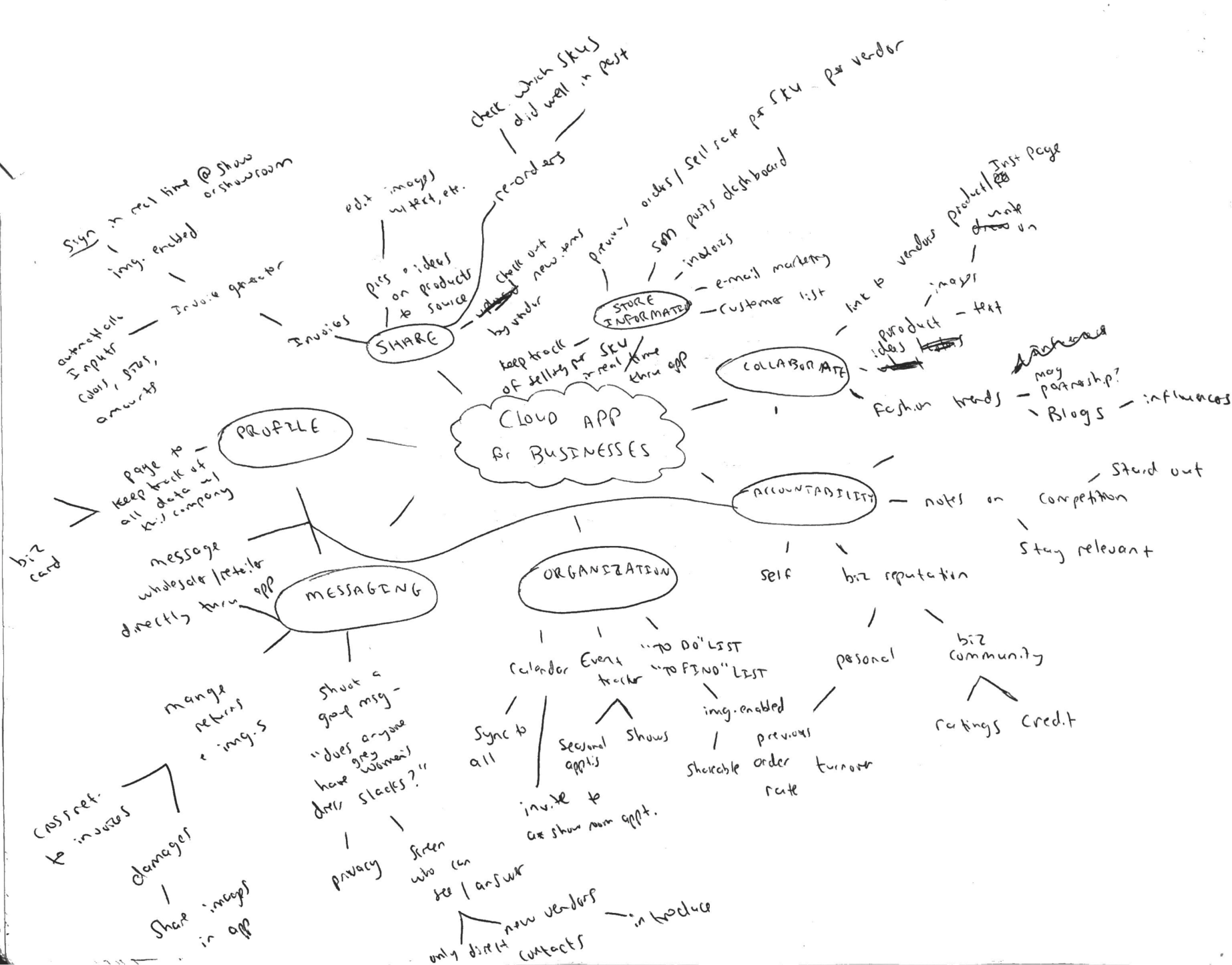
MIND MAPPING
These mind maps are a combination of user research, observation, and empathy. Each potential function of the app grew into possible directions to explore. It helped me start to identify problems that could arise. For example, being able to message multiple wholesalers at once was a high priority. Retail users had shared their competitive nature with me during interviews and observations. I spotted that this could present a serious privacy problem for them. It could also cause a lot of return spam messages. I needed to design messaging in a way that would solve these problems before they happen.
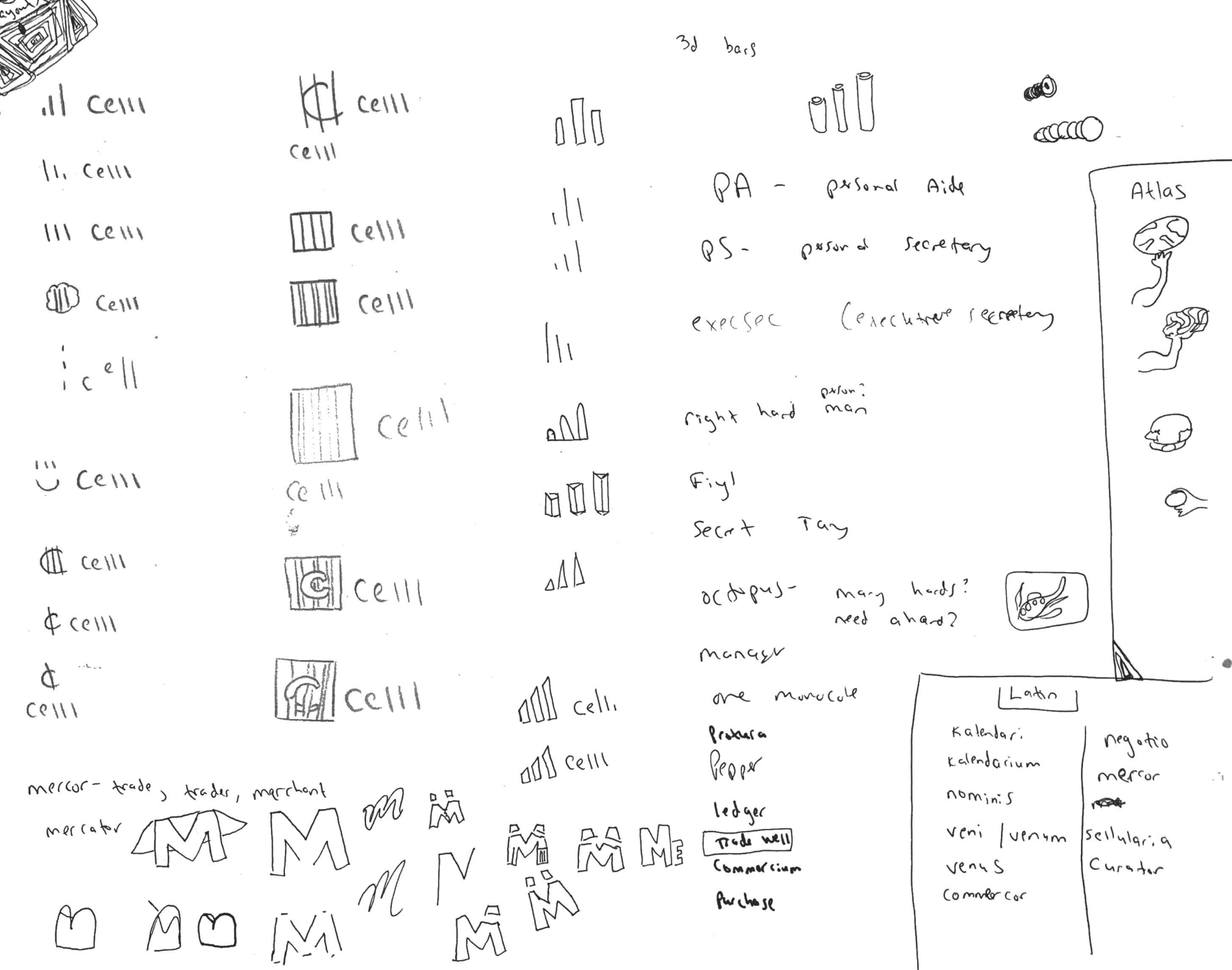
To name the app, I tried words for commerce in different ancient languages like Latin and Hebrew. I researched the origin of commerce and read up on the historical silk and spice trade routes. I played around with Greek Mythology, such as Atlas. The idea was that the app would take all the weight of running a business off our users' shoulders.
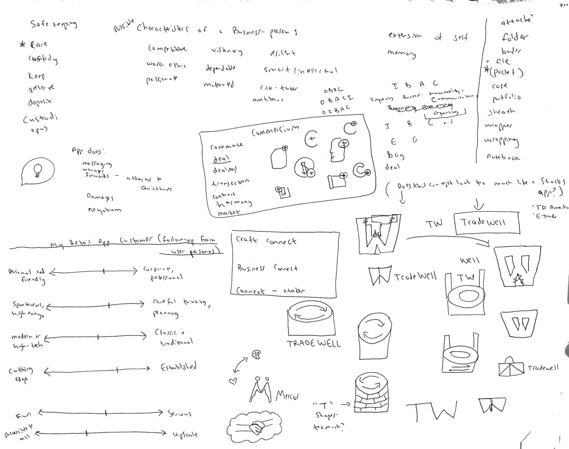
MORE SKETCHING
User research showed that privacy and safety are top priority for a business owner. That is what inspired the potential name “Celll”. for this app. I sketched two possible logo directions for "Celll". One of them was reminiscent of prison or a bank cell. The idea is that the app would hold and guard your information safely until the moment you need it. The other was a cell graph which looks like a business is trending and growing. At the same time, I contemplated "Atlas", I also contemplated "Mercator" with a “superhero” cape. That idea was to make a user feel that someone is swooping in to help them run their business stronger and faster. "Celll" had too negative a connotation and "Mercator" was both taken and too over-the-top.
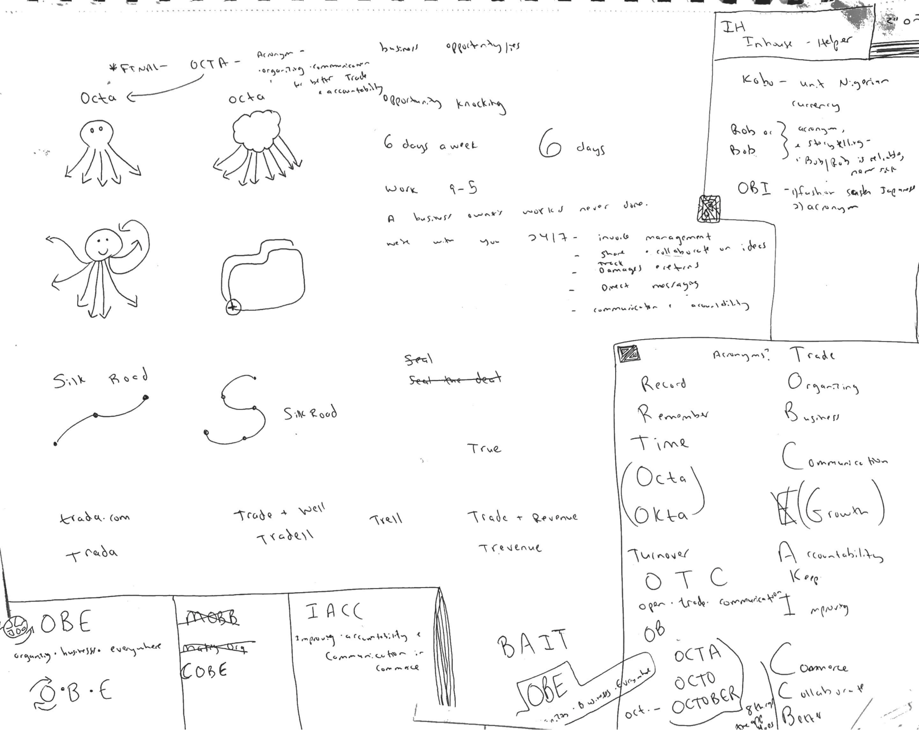
I did some research on acronyms and explored a few possibilities, before deciding on OCTA. OCTA fit because it made the most sense for what my users' needed. I learned during my interviews that business owners feel like they have to do everything on their own. They don’t want to give up control, but they feel like they need an extra pair (or three!) of hands. An Octopus fits that bill! OCTA also stands for “Organizing Communication for Better Trade and Accountability”. This covers all the problems that OCTA solves, in a nutshell.
MOODBOARD / LOGO
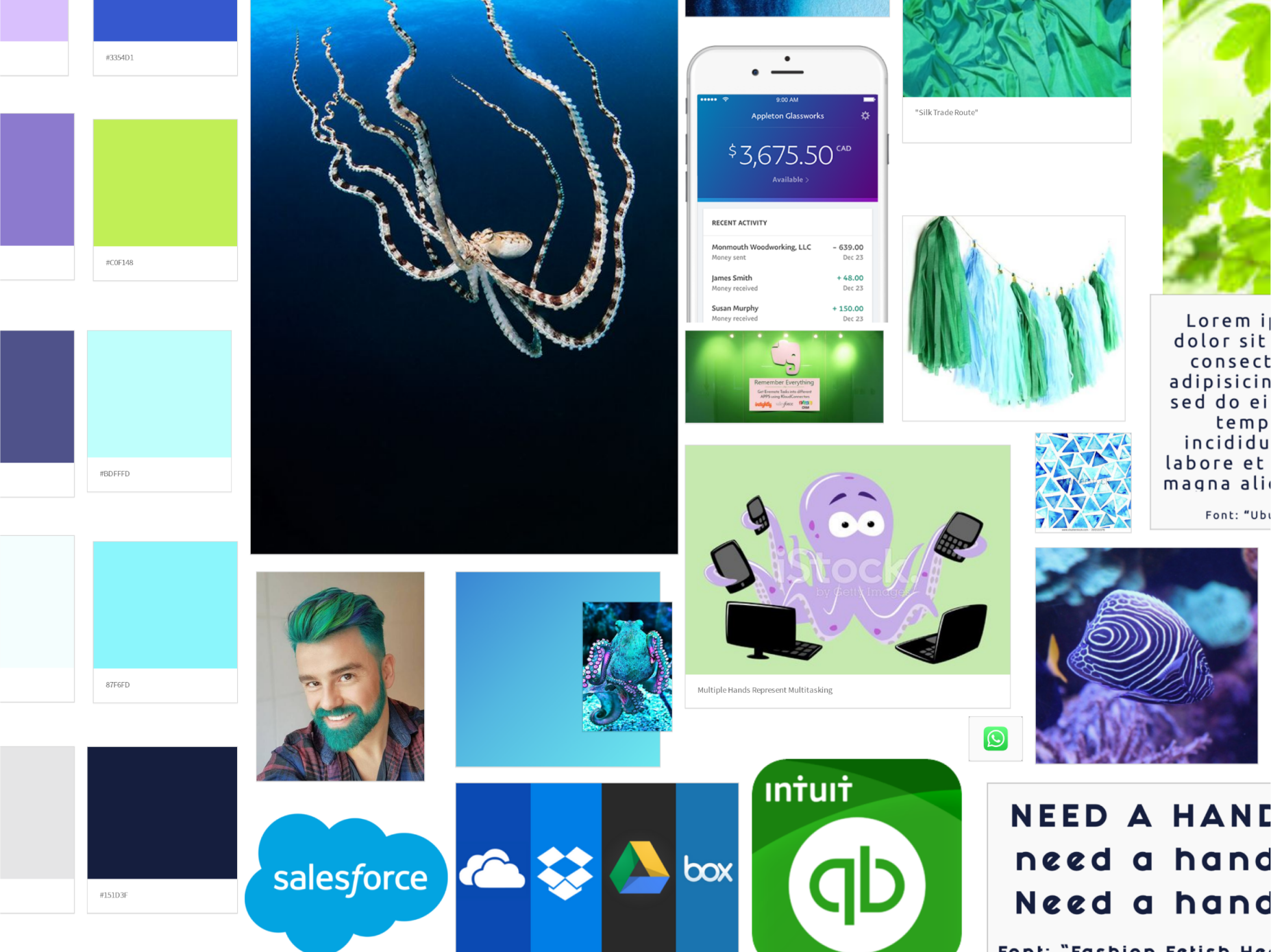
My research showed that business owners are used to using products like Dropbox, LinkedIn, Evernote, and Quickbooks for their business.
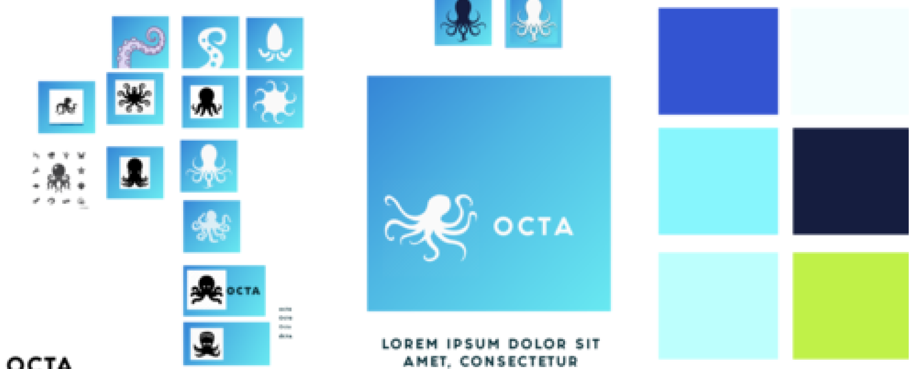
OCTA needed to mirror what a user would expect from a big brand like that, but stand out as a unique solution on their own. I used a mixture of blues and greens to create a solid graident that gives OCTA a modern, professional, and approachful personality.
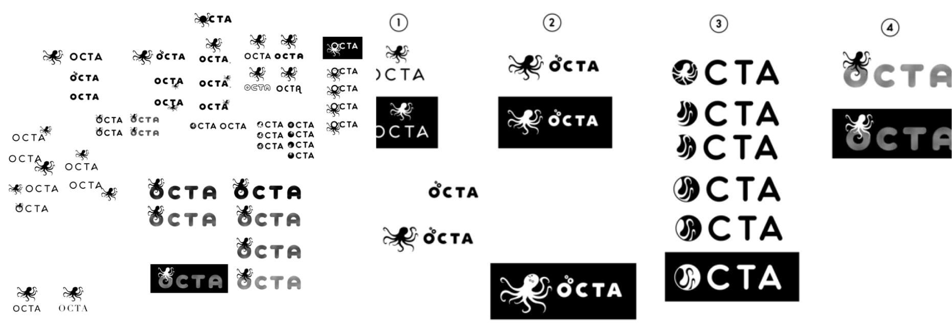
I tried some different Octopus icons on a gradient background before pushing OCTA's logo design back to black and white. I wanted the octopuses "hands" (tentacles) to stand out. But a complete Octopus looked childish and confusing. I decided on testing option 3 in the second sketch below against some of the others. I got excellent feedback from OCTA's users and went ahead with the design.
PREFERENCE TESTING - LOGO MARK
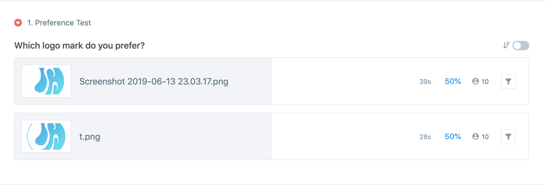
I conducted A/B testing on OCTA’s logo mark on 20 potential users. Opinions split exactly in half, so I paid close attention to the reasoning behind each user’s choice. The testers that liked the closed logo mark said things like, “It’s more clear/complete/defined”. The testers that liked the open mark said it was more “modern, compelling, and professional. Since OCTA is an app looking to modernize the way business owners work, we stuck with the open mark.
PREFERENCE TESTING - BUTTONS

HIFI Design
DASHBOARD
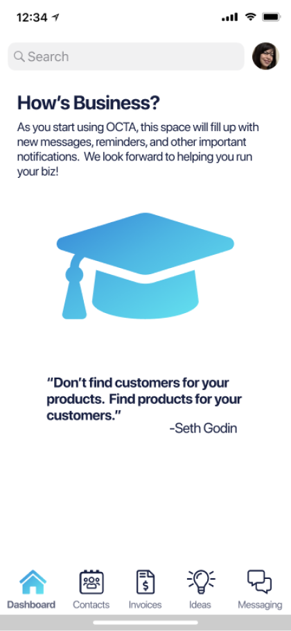
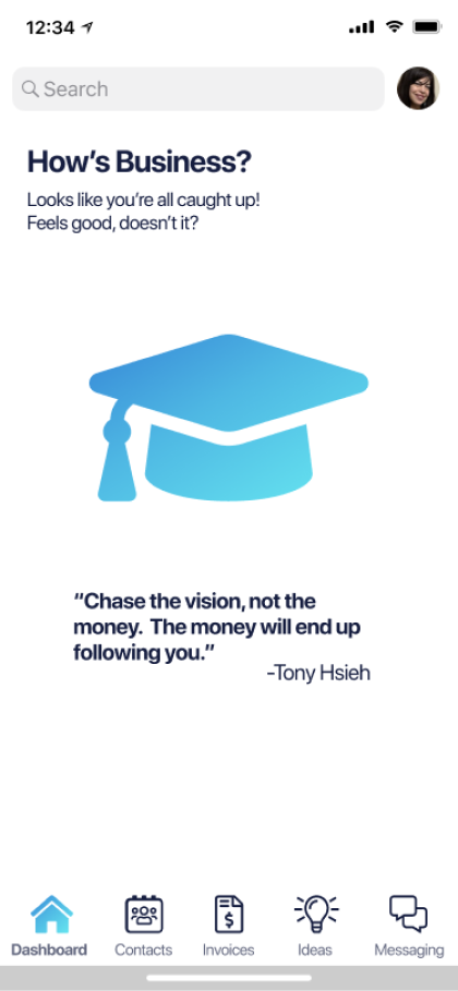
When a user first signs up for OCTA, the dashboard screen will tell them what it will display later on. (After a user plugs in their info and starts using the app.) It will later become a home for notifications that show a user exactly what is going on in their business. When a user is all caught up on notifications, the screen reverts back to a revolving set of business quotes. I chose these quotes to delight OCTA's users based on what I learned motivates them the most. Then they're free to sign off and work on their physical business.
CREDIT REMINDERS
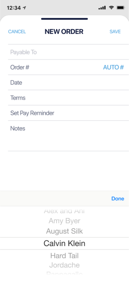
Users expressed frustration with forgetting the credits they had with their wholesalers. I designed a flow that helps them remember credits exactly when they need to use them.
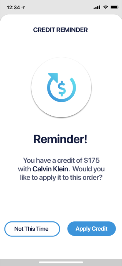
During invoice creation, a user chooses which supplier they are ordering from. If they have a credit with that supplier, they'll receive a pop-up reminding them of that credit.
A user can then choose to deduct that credit from their new order. This solves the problem of losing money of forgotten credits. This was an issue that came up in over 80% of users I surveyed.
UI COMPONENTS
I used color, type, and custom iconography to further communicate with OCTA’s users. Microcopy further enhances usability & communication.
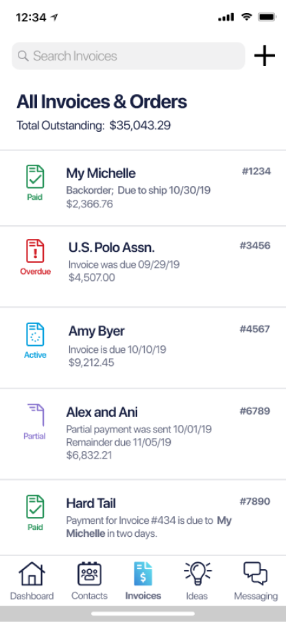
Users taught me that an invoice has a lifecycle. It starts as a purchase order and becomes a packing list invoice or a backorder. I had to communicate to the users where the invoice is in its lifecycle, and its payment status. I learned that every retailer has different payment term agreements with their suppliers. I listed payment options and used UI to communicate their status. For further usability, I adhered to the HIG and used text under each icon.
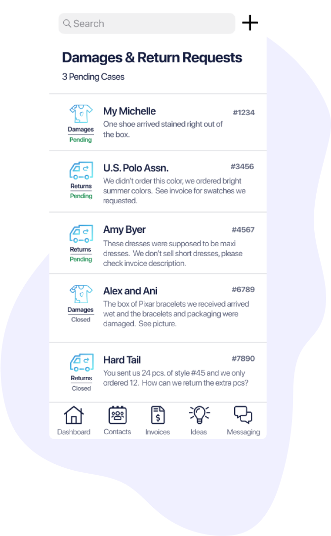
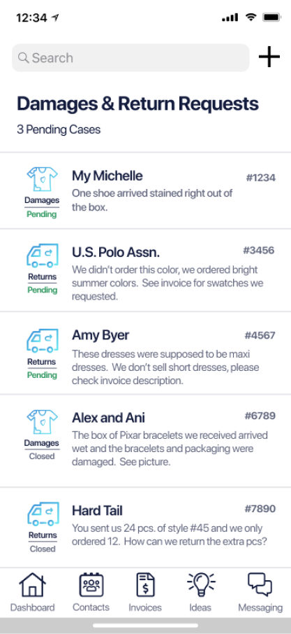
I helped a user differentiate between damages and returns by using iconography. I communicated the claim's status ("Pending" or "Closed") twice by using text and color.
TICS
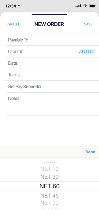
I replaced drop down menus with tics. This achieved more screen space and less buttons.
BUTTONS
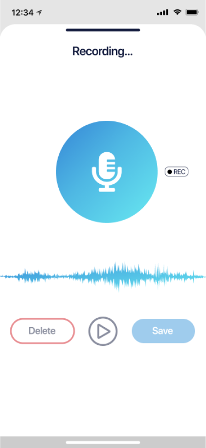
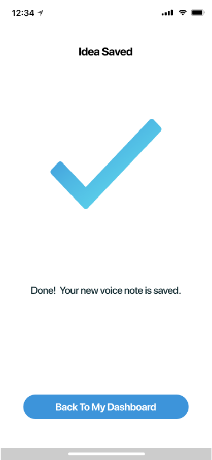
Too many confusing buttons were replaced by text for better usability. Boxed-in placeholders were replaced by open space.
STYLING
What I Learned
If I were to start this project over, I would design OCTA to be less mobile-specific and more operating system agnostic. I focused a lot on giving users the ability to create invoices and report damages using their phone’s camera. That distracted me from researching other ways I could achieve the returns flow. I’d like to update the design based on development and usage discovery.
After my research and design were complete, the developer and I opted to shift OCTA's development mobile to a progressive web app. The developer will still style the app with my iOS-like design. But it will work across mobile and other devices as a PWA.
Based on observation and user research, we suspect that our wholesale users will use the mobile version less. That is what prompted our late decision to develop OCTA as a progressive web app. The basic version of the wholesale-side will be free. We want to encourage wholesalers to connect with their retailers through the app. We plan on showing OCTA to wholesalers at trade shows to spread the word. Once we have a large database of retailers, we can offer a paid version of the program. Our wholesaler users expressed a universal goal of growing their business by finding more customers.
< return home
